Chris Briant WGSB AS Media Studies
Contents Page Construction

The first step in creating my contents page was to create a new document on Photoshop CS6, which measured 850x1200 pixwla, which is the correct dimensions for my magazines contents pages.

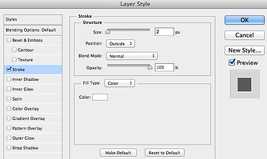

The first thing I added to my contents page was a sticker like piece of page furniture, for various bits of text to do with the contents page to be put onto the page. To do this, I selected the elipse tool which can be seen in the screenshot to the right. Below that is a screenshot of the size and the colour of the elipse I placed into my page. To continue the house style I seem to have created for my magazine I decided to make the elipse the colour of some of the text on my front cover. I then placed the shape onto the page so that only part of the shape covered the page, so that my masthead and other pieces of text could be inputted onto the page. After this I decided to add a stroke to the elipse on my page to make it stand out a bit more, so that the reader would be able to easily identify what this page is at a glance. I made the stroke size 2 pixels as any bigger looked too big on the page, the screen brought up to add this effect is shown in the third screenshot down on the right hand side. The outcome of these steps is shown in the screenshot below.


The next thing I did was to add my magazines name and the sub-title onto the sticker on my contents page. To do this I selected the horizontal type tool so that I could add the text onto the page. The size, colour and font of my magazines name is shown in the screenshot above and to the left. The outcome of this step is shown in the screenshot to the left. After this, I then added the sub-title onto the sticker by selecting the horizontal type tool again, and typing out "for the best music" onto my contents page. Te size, colour and font of the sub-title is shown in the screenshot above and to the left. The outcome of these steps can be seen in the screenhsot to the right.


Afterwards, I wanted to add the word "Contents" onto the page so my audience would know what page they are on and what it is going to include.To do this, I selected the horizontal type tool and typed out "Contents" then re sized the text to fit suitably on the page. The text font, size and colour can be seen in the screenshot above and to the right. I then decided to add a stoke effect to the text to make the word stand out on the page as it is important. The screenshot to the right shows the window that came up where I was able to change the size of the stroke, and in the end I made the stroke 3 pixels large as this made the word prominent, but didn't make it stand out too much. The outcome of these steps can be seen in the screenshot below.


The next thing I wanted to do was add another piece of text onto my contents page under the word "Contebts" saying "What to look out for in the issue...". I did this as I wanted to fill up most of the space on the contents page, as well as to inform the audience readint the page, what was on the page. To do this I selected the horizontal type tool and typed out "What too look out fo in this issue..." onto my contents page. The size, colour and font of this text can be seen in the screenshot above and to the right. I then decided to add a stroke effect onto the text so it would match the word "Contents" that I placed on the page in the previous step. I did this to make the layout of the page consistent. The screenshot to the left shows how big I made the stroke on this piece of text, and as you can see I made the stroke 3 pixels big. This is the same as the stroke on the word "Contents" as I wanted my contents page to look consistent. The outcome of these steps is shown in the screenshot below.
The next thing I added onto my contents page was a strapline with the issue date, and the issue number on it. To do this, I selected the horizontal type tool on the toolbar on the left hand side of photoshop, and typed out the text that I had previously planned to out on my contents page. The screenshot furthest above shows the size, font and colour of the text on the strapline. After this I wanted to separate these two pieces of text from the rest of the page, so I inserted a line across the top of the page to do so. To do this, I selected the rentangle tool and shaped a thin line that would span the width of the page. I then put this shape on the llayer below the sticker like banner so it wouldn't impact the layout of the page. The outcome of the is shown in the screenshot to the right.
After the previous step I added the page number, and the URL of my webite onto my contents page. I did this by selecting the horizontal type tool and typing out the two pieces of text on the page. The screenshot above and to the right shows the size, font and colour of the text for the page number, and the screenshot below that shows the size, font and colour of the text for the URL of my website. I then wanted to add a stroke to the two pieces of text, and the screenshot on the left shows how I added the stroke effect to each piece of text. I made the stroke size 3 pixels for each as this made the two pieces of text stand out, but wouldn't overshadow the other important pieces of text taht will be added later on. The outcome of these steps are shown in the screenshot below.


The next thing I did was to add a photo onto my contents page, as from the research I did, I found out that music magazines usually have around 3 or so pictuers on the contents page. To do this I went onto Google and searched up an image to do with one of the cover lines I would implement onto my contents page later on. The image is the image to the right, of Ed Sheeran during one of his concerts at Wembley Stadium. I placed the image onto my contents page, then resiez it accordingly so that it would fit onto the page. I then put the image on the layer behind the sticker like banner in the top right hand corner of the page, as this way the image would look well placed on the page. I then wrote some text on the image which reads "21 Ed Sheeran in concert" which will help my audience to identify where the image is in my magazine. The texts colour, size and font can be seen in the screenshot above and to the right. I then added a stoke effect to the text, and the stroke size I chose of 3 pixels can be seen in the screenshot to the right. The outcome of these steps can be seen in the screenshot below.


The next thing for me to do was to add the features onto my contents page. The first thing I did for this was to type out "Features" onto my page. I did this by selecting the horizontal type tool and typing out the word onto my page, the size, font and colour of this canbe see in the screenshot furthest above to the left. The next thing I did was to add the feature named "Free Poster" onto my page. The size, colour and font of this can be seen in the screenshot below the top one to the left. Then I wanted to add a stroke effect to these words to make them stand out, and so that it would fit in with the house style of my magazine. The screenshot to the left of the window, shows how large I made the stroke for these pieces of text, which turned out to be 3 pixels big. The photo below that screenshot is the photo I used for the free poster, and it is of my main artist. I did this because in magazines currently on the market, such as Q, they have the model on their front cover as well as the contents page. The screenshot below shows the outcome of these steps.


The next step to take, was to add another special feature onto my contents page, to do with David Bowie, as he recently passed away. To do this I typed out "3 David Bowie Tribute" onto my page, resized it so it looked suitable, then made the text the correct colour. Then, I used the stroke effect on the text so it would match my magazines house style. The screenshot above and to the right shows the size, colour and font of the text. The image to the right is the image I used of David Bowie to put onto my page, I decided to use this image as the colours in the image fitted well with my page as a whole. The outcome of these steps is shown in the screenshot below.
The last special feature I would add to my contents page would be an advertisement for Rihanna's "ANTi" world tour. This would be the last picture I added onto my contents page. To do this I imported the image onto Photoshop, then resized it so it would fit onto my page and not take up too much space. The image to the left is the image I used for this feature, as it is the offical advertisement image that is used for Rihanna's "ANTi" world tour. The screenshot below shows the outcome of this step. Also, I decided not to title this feature, as the image already states what it is all about.


The penultimate step I took was to add all of the features onto my contents page. To do this, I selected the horizontal type tool, then typed out each cover line onto my page. I then resized each one so they would fit onto the page, either making them bigger to seem more prominent, or making them smaller to fit them onto ym contents page. The screenshot above and to the right shows roughly how big each cover line is, however the text size varies from around 9pt to around 16pt at the most. I then added a stroke effect to each cover, and the screenshot to the right shows the size of the stroke efect that each cover line has. I settled on 3 pixels, as this made the cover lines stand out effectively. The screenshot below shows the outcome of these steps.

The last step I took was to add a cover line summary to each cover line on my contents page. I did this as well known magazines do this and I want to be seen in the same light as them. I added each summary onto the page, then resized it so it wold fit suitably onto the page. I then decided against the use of a stroke effect for each cover line summary, as this matches the house style of my magazine. This is because, on my front cover, the cover line summaries don't have stroke effects on them. The screenshot above and to the left shows the size, font and colour of the cover lines summaries. However, the sizes vary from around 7 pt, to around 11 pt at the most. I made them on average smaller than the cover lines, so they ouldn't draw attention away from their subsequent cover line. The outcome of this step is shown in the screenshot to the left.

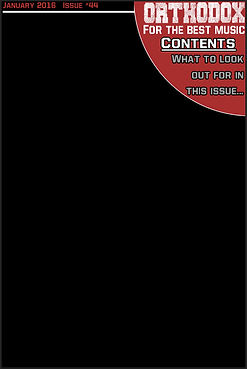
Below is the final outcome of my contents page for my magazine.

However, I made the mistake of not including self taken images onto my contents page, so I had to change this for my coursework to be eligible for marking. Below is the final draft of my contents page of my magazine.